Geschichte und Entwicklung des Rossi-Logos
Evolution als roter Faden.
as Logo eines Unternehmens ist eine seiner wichtigsten visuellen Repräsentationen und wird häufig als Symbol der Wiedererkennung und Kommunikation für Kunden und die breite Öffentlichkeit verwendet.
In den vergangenen 70 Jahren hat sich das Rossi-Logo ebenso wie das Unternehmen weiterentwickelt.
1950S
![]()
Anfang der 1950er Jahre bestand das Logo aus einem Piktogramm, das sich aus den Initialen des Gründers (Gilio Rossi) und einem Zahnrad, einem der grundlegenden Bestandteile von Getriebemotoren, zusammensetzte. Ergänzt wurde das Logo durch einen Schriftzug, der sich auf den Firmennamen bezieht. Die Verwendung der serifenlosen Schrift unterstreicht die Avantgarde, die Rossi Motoriduttori bereits in den Anfangsjahren auszeichnete.
Im Laufe der Jahre wurde dieses Logo geändert. Die Farbe Schwarz wurde durch Grau ersetzt, eine weniger aggressive Farbe, und von einem flachen Stil ging man zur Verwendung von Farbverläufen über, um ein Gefühl der Bewegung zu erzeugen.
JAHRESZEITEN 2000
Im Jahr 2012 schloss sich Rossi der Habasit-Gruppe an, dem weltweit führenden Hersteller von Transport- und Antriebsriemen, der heutigen Moovimenta-Gruppe.
In Übereinstimmung mit dem Corporate Image der Gruppe änderte Rossi sein Logo, das scharf und mit einem deutlichen Kontrast zwischen Grün und Rot erscheint, was es leicht unterscheidbar und lesbar macht.
2019
Eine neue Corporate Identity wird zum Leben erweckt.
![]()
Im Jahr 2019 führte Rossi ein neues Logo ein, das die Werte und Eigenschaften eines dynamischen, zukunftsorientierten Unternehmens zum Ausdruck bringen soll.
Die neue Marke ist Teil der Strategie und der neuen Positionierung von Rossi, die das Unternehmen als dynamisch, flexibel, nachhaltig und fortschrittlich definiert und den Kunden in den Mittelpunkt seines Handelns stellt.
Die visuelle Identität identifiziert die neue Vision: ein energiegeladenes und kreatives Zeichen, ein "R", das nicht nur die Initiale des Namens ist, sondern auch für die Kraft der Ideen, die Dynamik und die technologischen Innovationen steht. Daneben steht der Schriftzug "Solutions for an evolving industry", die DNA von Rossi, der die Unternehmensphilosophie widerspiegelt: flexible und innovative Lösungen für eine sich ständig verändernde industrielle Welt.
![]()
SPEZIELLE LOGOS
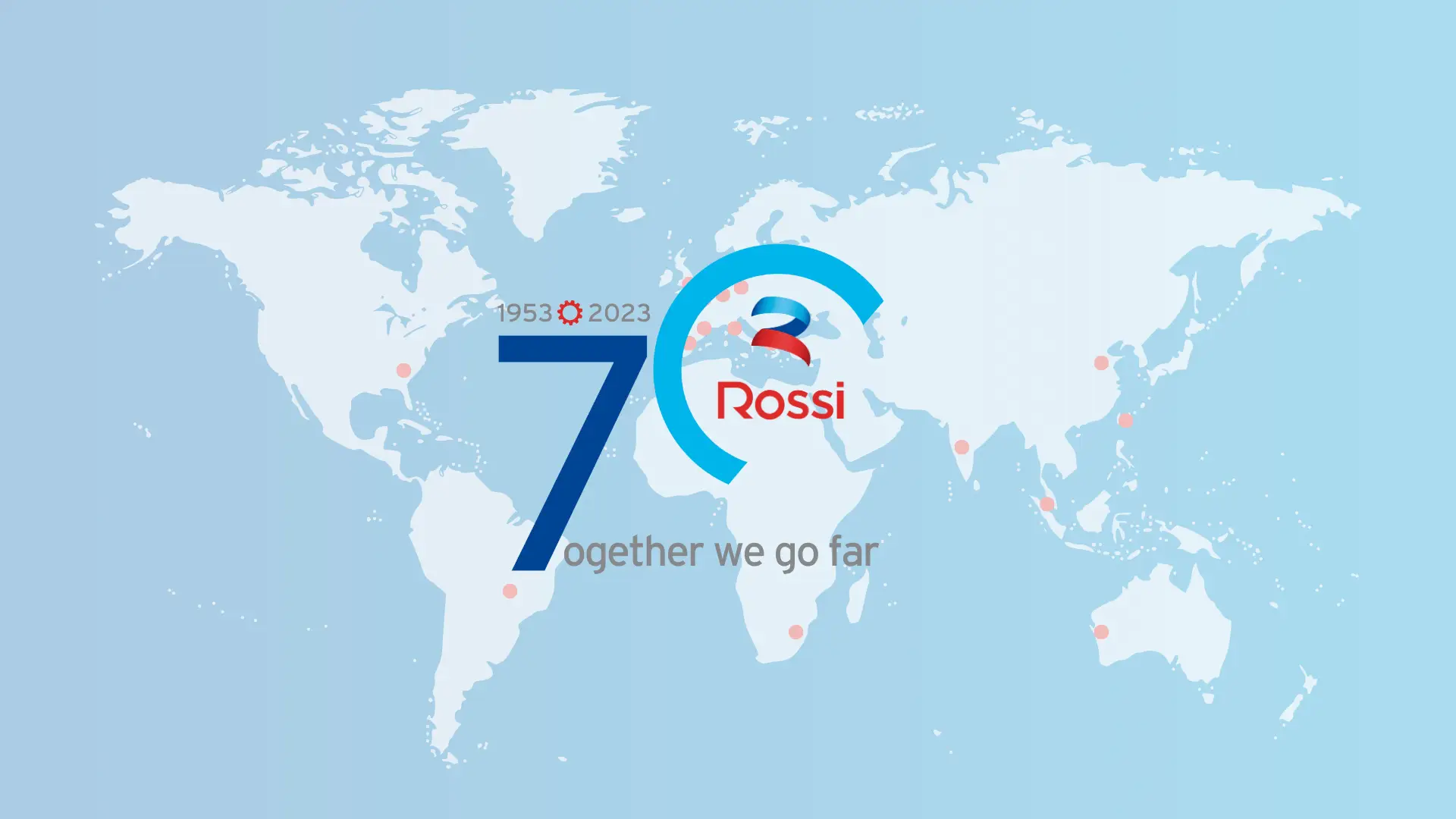
2023
![]()
Anlässlich des 70. Jahrestages im Jahr 2023 wurde ein Ad-hoc-Logo geschaffen.
Unternehmen und Menschen. Dies sind die beiden Schwerpunkte des neuen Logos, das diesem Meilenstein gewidmet ist.
- Die Null in der Zahl "70" ist absichtlich nicht geschlossen und vermittelt ein Gefühl von Dynamik. Die Geschichte von Rossi ist noch nicht abgeschlossen, und der Weg wird lang und erfolgreich sein.
- Der Abschluss "7ogether We Go Far" ist ein Dank an alle, die an der 70-jährigen Geschichte beteiligt waren.
Other Blogs